When optimizing user onboarding flows, the completion rate number of users who started the flow / number of users who finished the flow isn‘t the right KPI.
If that wouldn‘t be true, you could reduce the number of screens to a single one with a big fat „click here“ button and your completion rate will be 98%. 2% always drop-off, no matter how easy it is to click through 🤷♂️.
That‘s not why there is user onboarding. It exists to achieve a specific goal of getting your new users to their Aha!Moment - the moment when they realize the value of your product for them.
That‘s not at the end of a series of explainer screens, walkthrough tours, setup screens or other-things-to-get-out-of-my-way-to-finally-see-and-use-what-I-came-for. It‘s when I understand and use your product so it delivers meaningful value. Try to measure that instead.
—— We recently re-designed the onboarding flow of XING and ended up with twice the amount of screens in the flow. Our onboarding completion rate dropped 😎 Here is how it looks like.
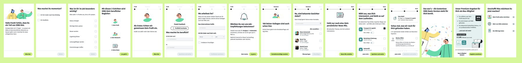
A UX Designer actually suggested we should reduce the screens to get more people through the flow. I suppose he didn‘t understand the aim of the flow. It‘s not about maximizing the number of users at the end but to maximize the number of new users who turn into happy, engaged members of our network.
Not sure if we‘ll achieve that it‘s currently running as an AB test but if we don‘t, I‘m sure it won‘t be because of the number of screens but because their content isn‘t the right fit for purpose.
I‘ll let you know when the results are in 👨💻